Plan-Apps Dashboard 3.0
Marketing and media planning web platform
2025

Case Study Summary
The existing Dashboard 2.0 was slow, hard to navigate, and lacked advanced data insights. Users struggled with limited filtering, no AI recommendations, and poor cross-retailer comparisons, making it difficult to make fast, data-driven decisions.
My Role:
Led end-to-end UX design for Dashboard 3.0
Conducted user research (interviews, analytics, competitive benchmarking)
Developed personas, user journeys, and flows
Designed wireframes and high-fidelity prototypes
Collaborated with PMs and developers to iterate designs and test usability
Provided design guidance during implementation and post-launch analysis
Outcome:
Users found it easier to explore data and generate insights
Improved clarity and usability across dashboards and filters
AI-powered recommendations helped users make faster, more informed decisions
Laid the foundation for future enhancements like collaborative dashboards and cross-account benchmarking
Project Details
Role: UX Architect - SMG (Plan-Apps Platform)
Duration: 3 months
Team: Product, Engineering, Design
Tools: Figma, Miro, Jira, Confluence, Hotjar, Google Analytics
The Problem
The existing Plan‑Apps Dashboard 2.0 was difficult for users to navigate and didn’t provide the depth of insight needed to support fast, informed decision‑making. Users faced limited filtering capabilities, restricted data access, a lack of first‑party data integration, and no AI‑driven guidance. As a result, key user groups including brand analysts, agency planners, and retail media specialists struggled to analyse campaigns, compare performance across retailers, and derive actionable insights efficiently. This hindered the ability of teams to make confident, data‑driven decisions and reduced the overall value of the platform.
Hypothesis
If we redesign the Plan‑Apps Dashboard 3.0 within the Plan‑Apps platform to provide an intuitive layout, advanced filtering, integrated first-party data, and AI-powered recommendations, then users will be able to explore campaign performance more efficiently, gain deeper insights, and make faster, data-driven decisions, ultimately increasing satisfaction and adoption of the platform.
Business Goals
Improve usability and make it easier for users to navigate and explore campaign data
Enable deeper insights with first-party data integration and AI-powered recommendations
Increase adoption across brand analysts, agency planners, and retail media specialists
Build a scalable, future-ready dashboard for new features like collaboration and predictive analytics
Challenges of existing Dashboard 2.0
The existing Dashboard 2.0 had several limitations, including:
Restricted access, available only to subscribers
Basic filtering capabilities
Lack of intuitive user experience
Absence of first-party data integration
No AI-powered features
Research & Discovery
Research goals
To build a deep understanding of how users interacted with the existing Plan‑Apps Dashboard 2.0 and uncover the core problems preventing them from gaining fast, actionable insights.
The primary aims were to:
Understand user pain points and unmet needs within the existing dashboard experience
Identify opportunities to improve usability, data exploration, and decision‑making workflows
Benchmark competitors to uncover industry standards and differentiation opportunities
Research approach
To ensure the redesign was grounded in user needs and business priorities, I led a mix of qualitative and quantitative research activities, including:
Stakeholder Interviews: Engaged product leads, product managers, business analysts, and senior developers to define goals and constraints.
User Interviews: Conducted structured interviews with four core user groups across the Plan‑Apps platform (Retail Media Networks, subscribed brands, unsubscribed brands, and agency users) to explore workflows, frustrations, and feature requests.
Competitor Analysis: Benchmarked industry dashboards (e.g., Braincrush and Zitcha) to understand best practices and feature opportunities.
Analytics Review: Assessed usage data from Plan‑Apps Dashboard 2.0 to identify where users struggled and which features were under‑utilised.
Key Insights
Research surfaced several recurring themes that directly informed the redesign:
Complex Navigation: Users found the existing dashboard unintuitive and difficult to explore efficiently.
Limited Filtering & Customisation: Essential data exploration tools were missing or too basic for advanced workflows.
Lack of Data Depth: Absence of first‑party data and cross‑retailer analysis limited insight value.
Missing AI Support: Users wanted guidance and recommendations rather than just raw numbers.
These insights helped shape clear design goals and priorities for Dashboard 3.0.
Competitor Analysis: Braincrush & Zitcha
Competitor Analysis: Braincrush & Zitcha
As part of the UX research for Dashboard 3.0, we conducted a competitive analysis to benchmark industry standards, identify gaps, and uncover opportunities for differentiation. Two key competitors were Braincrush and Zitcha, both offering digital product dashboards with similar functionalities.
The slideshow below provides a deep dive into the competitor analysis, highlighting their strengths, weaknesses, and opportunities that informed the Plan‑Apps Dashboard 3.0 redesign.


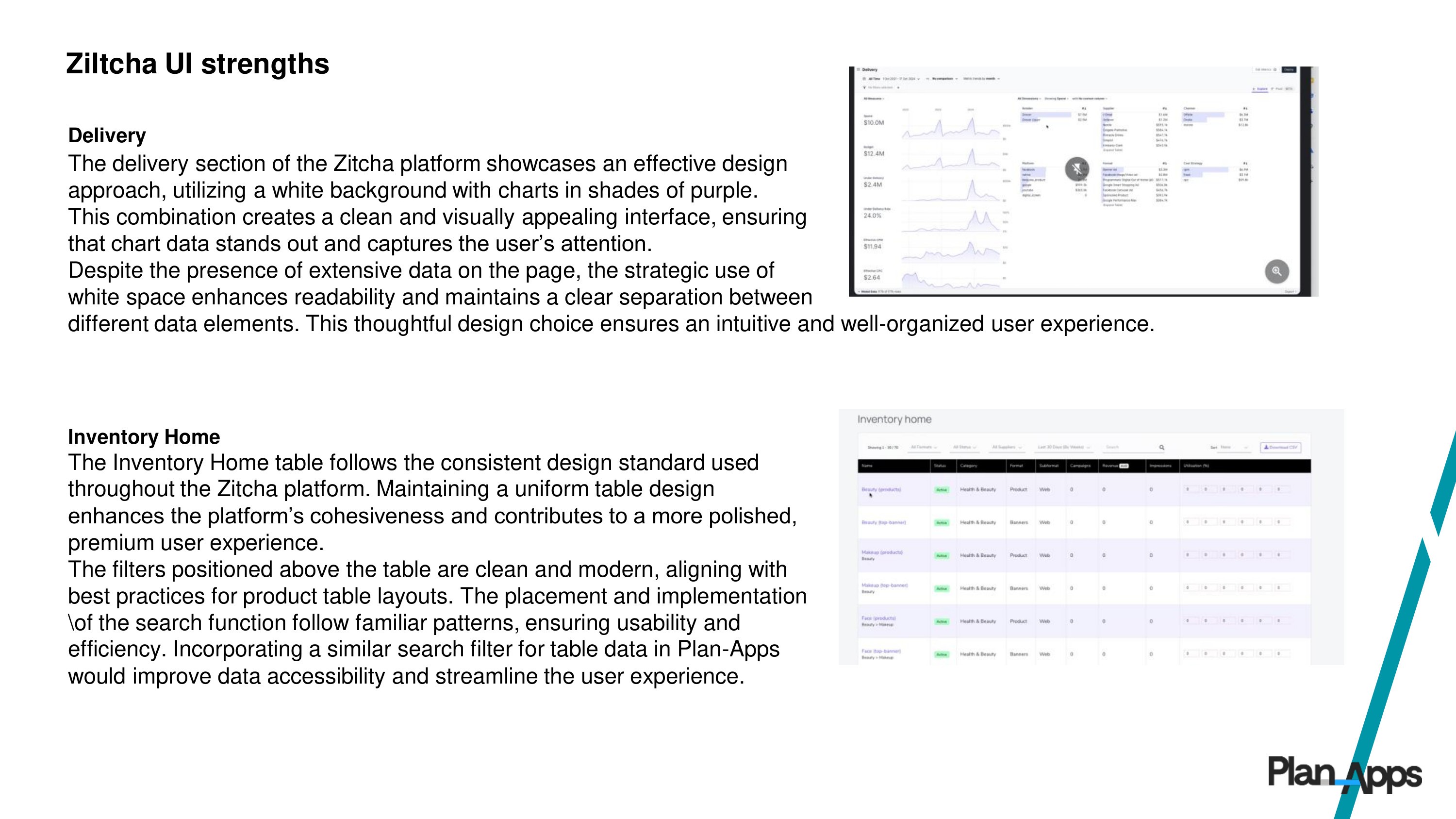
Key Takeaways from Competitor Research & Differentiation Strategy
Key Takeaways from Competitor Research & Differentiation Strategy
Based on the competitive analysis, Dashboard 3.0 was designed to balance advanced data capabilities with an intuitive user experience, directly addressing pain points observed in competitors. Our approach focused on four key areas:
Simplicity & Usability – Unlike Braincrush, our dashboard simplifies complexity with a more intuitive and accessible interface.
AI-Driven Insights – Leveraging AI to provide actionable recommendations, improving on Zitcha’s automation strengths.
Customization & Scalability – Flexible filtering and personalized features to cater to a broader user base.
First-Party Data Integration – Enabling deeper, more accurate insights compared to competitors with limited data access.
By focusing on these areas, Dashboard 3.0 positions itself as a smart, scalable, and user-friendly solution that empowers brands to make faster, more informed decisions.
Design Evolution - Plan Apps Dashboard 3.0
Creating an enhanced and intuitive Dashboard 3.0 required a structured UX process focused on user needs, industry best practices, and AI-driven innovation. The design evolution can be broken into three key areas:
How Research Informed Design
Research insights formed the foundation for all design decisions. Key activities included:
Stakeholder Interviews: Engaged product leads, PMs, business analysts, and developers to define project goals and constraints.
User Interviews: Conducted in-depth sessions with four main user groups:
Retail Media Networks (Boots, Morrisons, Tesco)
Subscribed Brands (AB InBev, Unilever)
Unsubscribed Brands (L’Oréal)
Agencies (Capture)
Competitive Analysis: Braincrush & Zitcha were analyzed to benchmark industry standards, identify gaps, and inform differentiation strategies. (Slide show below shows the deep dive.)
Data & Analytics Review: Examined Dashboard 2.0 usage to pinpoint friction points and feature gaps.
Key Takeaways:
Complex navigation and poor usability
Limited filtering and customization
No AI-driven recommendations
Lack of first-party data integration
No cross-retailer analysis
These insights guided design goals, including usability, AI integration, and improved data exploration.
Wireframes & Concept Exploration
With research insights defined, the focus shifted to ideation and low-fidelity exploration, translating user needs and business goals into a clear dashboard structure.
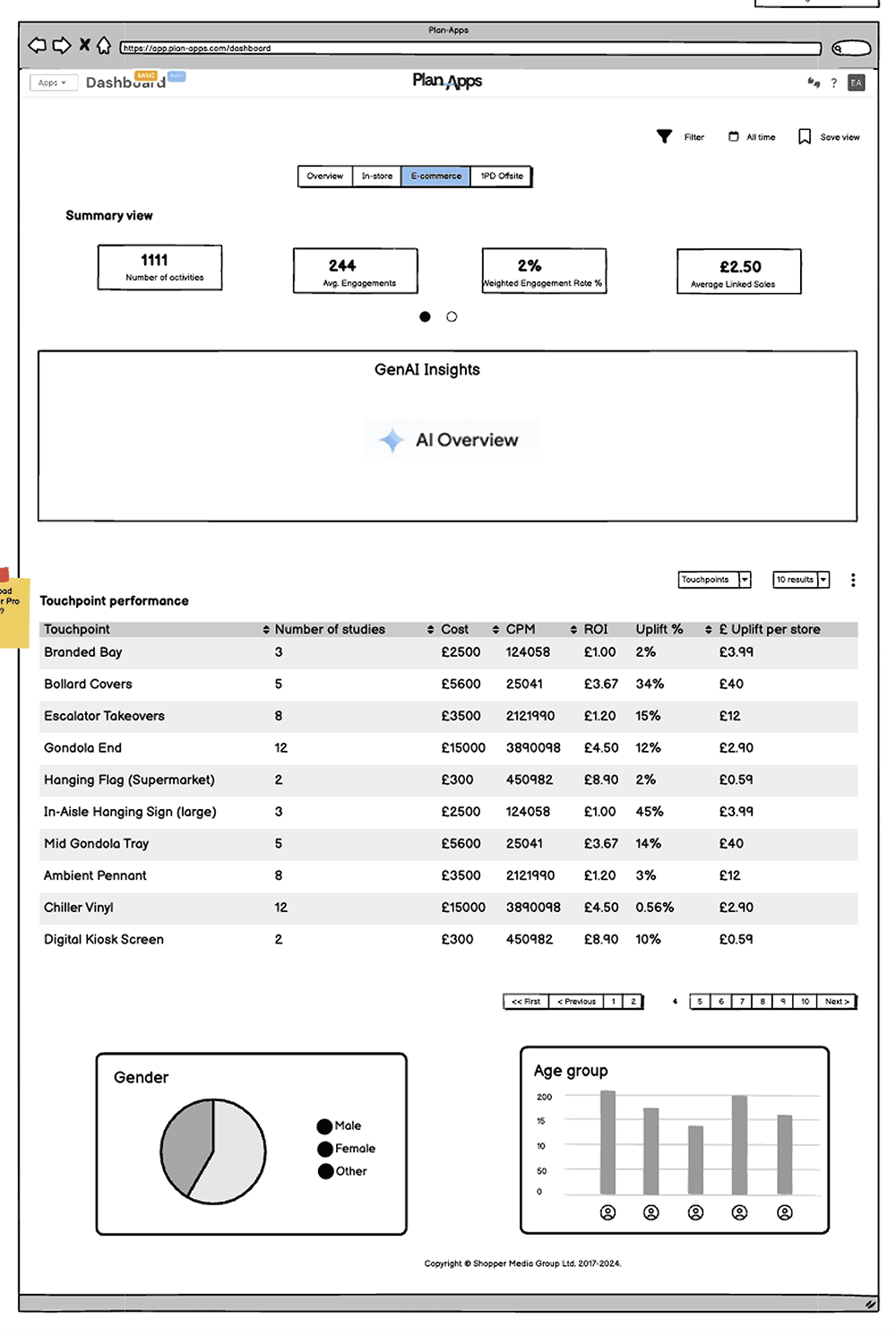
Low-Fidelity Wireframes: Created in Balsamiq to define layout, information hierarchy, and UX architecture across all four dashboard areas: Overview, In-Store, E-commerce, and 1PD-Offsite.
User-Centred Structure: Wireframes were designed to support different user types and use cases while aligning with modern dashboard patterns and best practices.
Stakeholder Collaboration: Wireframes were reviewed with Product Managers, engineers, and key stakeholders to gather early feedback and assess technical feasibility.
Iterative Refinement: Feedback was synthesised and applied across multiple iterations, refining layout, data grouping, and interaction patterns.
Validation with External Users: Once stabilised, wireframes were shared with RMNs and brand users to validate assumptions and direction.
Multiple Dashboard Versions: Separate wireframes were developed for PRO (subscriber) and Basic (guest) experiences to reflect differing levels of access and user needs.
Balsamiq Wireframes
Initial low-fidelity wireframes focused on structure over visual polish, allowing rapid exploration of layouts and workflows across all dashboard tabs.


Low-fidelity Dashboard Basic wireframes in Figma:
Refined low-fidelity designs for the Basic (guest) dashboard, highlighting AI-driven insights and high-level brand performance to deliver immediate value for non-subscribed users.


Low-fidelity Dashboard PRO wireframes in Figma:
Defined the structure for the PRO (subscriber) dashboard, focusing on advanced filtering, cross-retailer analysis, and scalable layouts to support more complex user workflows.
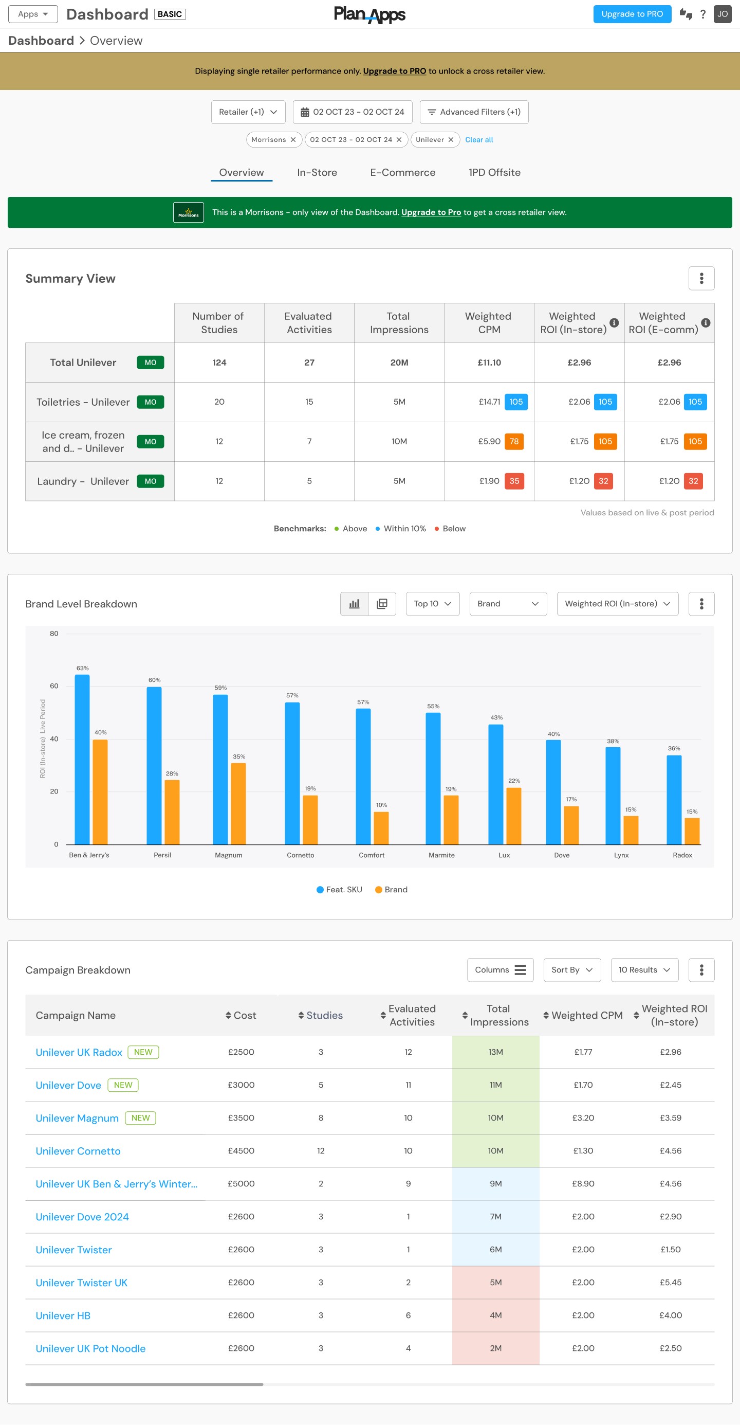
High-Fidelity Design & Prototyping
After validating the low-fidelity wireframes with stakeholders and users, the project moved into the next stage of the design process: high-fidelity UI design and interactive prototyping.
Using Figma, I translated the approved wireframes into polished, high-fidelity designs, applying the existing design system and style guide to ensure visual consistency, scalability, and efficient collaboration with development.
To support validation and feedback, I created clickable interactive prototypes, enabling stakeholders and users to experience realistic user flows and interactions prior to development.
Key design considerations and features included:
AI-driven insights surfaced contextually to support faster, more informed decision-making
Advanced filtering and personalization to accommodate different user needs and use cases
Cross-retailer comparison tools to unlock broader performance insights
Clear data hierarchy and visual prioritisation to improve readability and reduce cognitive load
These high-fidelity designs formed the foundation for usability testing, final stakeholder sign-off, and subsequent development.
Plan Apps Basic Dashboard
- Overview, In-store, E-commerce, 1PD Offsite


Development / Engineering Handoff & Launch
Objective: Ensure high design fidelity, scalability, and smooth delivery from prototype to production.
Close Engineering Collaboration: Worked daily with engineers throughout the build phase to ensure the high-fidelity prototypes were implemented accurately, resolving design and technical constraints in real time. This tight feedback loop helped maintain design intent while supporting efficient delivery.
Design System & Component Build-out: Collaborated with engineering to extend the design system, adding new reusable components that were built and documented in Storybook. This enabled modular feature development and ensured consistency across Dashboard 3.0 and the wider Plan-Apps platform.
Modular & Scalable Implementation: Designed components with reusability in mind, allowing features to be shared across multiple dashboard areas and future platform initiatives, reducing duplication and improving long-term maintainability.
Design Handoff: Provided well-structured Figma files, detailed annotations, and interactive prototypes to support accurate implementation and reduce ambiguity during development.
Final QA & Launch Readiness: Led final design QA in collaboration with engineering, validating responsiveness, accessibility considerations, and interaction behaviour prior to release.
Post-Launch Evaluation & Continuous Improvement
Objective: Validate real-world usage and identify opportunities for ongoing improvement.
Following the launch of Dashboard 3.0, we focused on understanding how users interacted with the new experience and where further optimisation could add value.
User Feedback: Collected qualitative feedback from brands, agencies, and RMNs to understand day-to-day usage and perceived improvements over Dashboard 2.0.
Behavioural Insights: Used tools such as heatmaps and analytics to observe engagement patterns across key dashboard areas, including AI-driven insights and filtering.
Continuous Iteration: Insights from post-launch feedback informed a prioritised backlog of refinements and future enhancements.
Results & Impact of Dashboard 3.0
Dashboard 3.0 delivered a more intuitive, scalable, and insight-led experience for users across the Plan-Apps platform.
Key outcomes included:
Improved usability: Clearer data hierarchy and simplified interactions made it easier for users to explore insights and understand performance.
Stronger insight discovery: AI-driven recommendations and cross-retailer analysis helped users surface opportunities more quickly.
Better alignment to user needs: Advanced filtering, personalisation, and first-party data integration addressed key pain points identified in Dashboard 2.0.
Overall, users reported feeling more confident using the dashboard to support planning, reporting, and decision-making.
Capture (Brand & Retail Partners)
"The new dashboard has completely changed how we analyze data. The AI recommendations are a game-changer, helping us identify key opportunities we would have otherwise missed. Filtering and customization options are finally on par with what we need!"
Retail Media Networks (RMNs)
"Dashboard 3.0 is exactly what we needed—simple yet powerful. The ability to integrate first-party data has significantly improved our targeting accuracy. The engagement
heatmaps show that our teams are spending more time on insights that matter."
AB InBev (Brand User)
"The previous version lacked real-time insights, but now we can quickly access AI-driven reports with actionable recommendations. The intuitive design allows our teams to collaborate more efficiently across multiple markets."